
Gold Explains Silver Until Leverage Takes Over
A research note on what actually moves silver, built by testing nine commonly-cited explanations against real data.

Every piece of silver commentary I’d read leaned on the same handful of explanations the dollar, interest rates, inflation, speculative trading positions stated with total confidence and almost never actually checked against data. I wanted to know which of these popular explanations hold up, and which ones just sound right.
A quick note on method before diving in: throughout this piece I use a “p-value” to mean how confident we can be that a result is real and not just random noise. The convention in research is that anything under 0.05 (a 1-in-20 chance of being a fluke) counts as “statistically significant” worth taking seriously. I’ll flag every number this way so it’s clear which findings are solid and which are just suggestive.
Part I — Silver on a Normal Day: A Leveraged Version of Gold
Most of the time, silver simply moves like gold, but more so and copper plays a smaller, real supporting role.
Gold is the dominant driver, and it’s not just correlation, it actually leads. Across four years of daily data, gold explained more of silver’s day-to-day movement than anything else I tested, and this held true significantly (p<0.0001) in every version of the analysis. I also ran a Granger causality test, a statistical method that checks whether knowing one thing’s past values actually helps predict another thing’s future values, beyond what you’d already know from that thing’s own history. Gold passed this test for silver (meaning gold’s past moves genuinely help predict silver’s future moves), while silver did not pass it for gold. In other words, gold leads, silver follows not just they move together.
I also tested whether this gold relationship breaks down when markets get chaotic, using something called a “regime-switching model” , a statistical tool that automatically sorts each day into one of two buckets (”calm” or “turbulent”) based on how the data actually behaved, rather than me deciding in advance. It found that silver’s sensitivity to gold barely changed between the calm bucket and the turbulent bucket , what changed was simply how noisy/volatile the days were, not which factor was actually driving things. So gold doesn’t lose its grip during chaos; the chaos is just louder.
Copper matters too, and including it exposed a problem with how everyone talks about the dollar. Copper showed a real, significant relationship with silver on its own. But here’s the catch: once I put copper into the same model as the US Dollar Index (DXY) : the index everyone blames for silver’s moves, the dollar’s apparent effect mostly disappeared. That’s because the dollar and copper often move for the same underlying reason (global growth and risk sentiment), so testing the dollar alone was accidentally giving copper’s credit to the dollar.
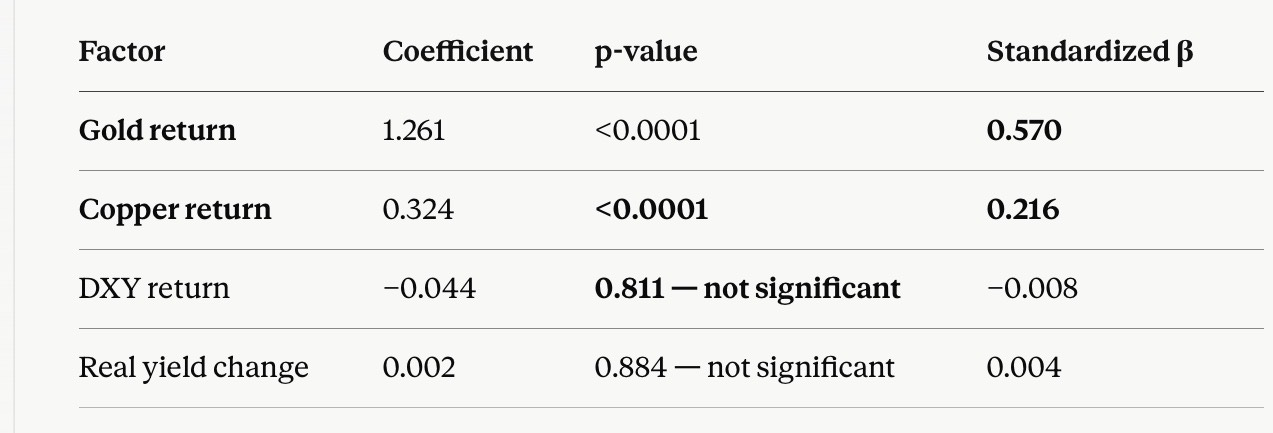
The dollar matters but only when nothing else is happening, which is the opposite of the popular narrative. I split the data into “calm periods” and “stressed/volatile periods” (using two different methods, which agreed with each other) and tested the dollar’s relationship with silver in each. In calm periods, the dollar had a real, statistically significant negative relationship with silver (meaning dollar up → silver down, reliably). In stressed periods, that relationship vanished. Most people assume the dollar matters more during a crisis, like a flight to safety. My data says the opposite: during a crisis, gold and the other factors below dominate so completely that the dollar’s influence gets drowned out.
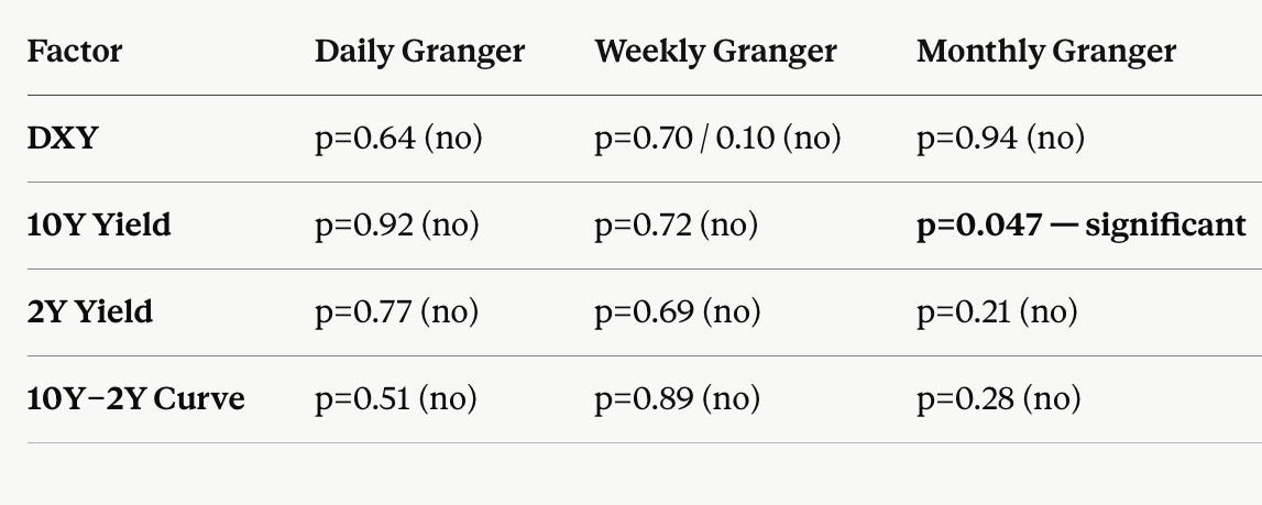
“Real interest rates” , the rate left over after subtracting expected inflation turned out to matter less than ordinary, plain interest rates, even though economic theory says real rates should be the “correct” variable for pricing precious metals. The plain 10-year Treasury yield showed a weak but real relationship with silver, visible only when you look a month at a time rather than day to day. The inflation-adjusted version showed essentially nothing, at any timeframe. Sometimes the “theoretically correct” number loses to the cruder one that the market actually watches.
Oil and CPI inflation, surprisingly, told us nothing about silver once tested properly. Oil added zero useful information once gold and copper were already in the picture. CPI is the most interesting failure: if you just compared the actual price levels of silver and CPI inflation over four years, you’d get what looks like an extremely strong relationship both numbers were going up the whole time. But that’s a classic statistical trap: two unrelated things that are both generally rising over time will always look related if you compare their raw levels instead of their period-to-period changes. Once I corrected for this (a check called a “stationarity test,” which flags series that just trend upward rather than bouncing around a stable average) and properly compared month-to-month changes instead, the apparent relationship between silver and CPI vanished completely, it had been a mirage the whole time.
Part II — Silver Under Stress: Two Kinds of Investors Pulling in Different Directions
When markets get tense, a different story takes over: how much physical silver actually exists versus how many paper bets are riding on it, and whether the “fast money” (leveraged futures traders) and the “slow money” (ETF investors who just buy and hold) are doing the same thing or fighting each other.
The CFTC publishes a weekly report (called “Commitments of Traders,” or COT) showing how heavily futures speculators are betting long or short on silver. I tracked 20 years of this data. On its own, it didn’t predict silver’s next move with any statistical reliability, past positioning didn’t forecast future price changes, and vice versa. I also tested the popular trading heuristic that says “rising bets + rising price = healthy trend, falling bets + rising price = warning sign of a top” and so on. It failed: the supposedly “healthy” combination actually preceded below-average returns, and the supposedly “warning sign” combination preceded above-average returns , backwards from the popular story. To be precise rather than overclaiming: within this specific four-year window and the tests I ran, COT data didn’t show reliable directional predictive power. I can’t promise that’s true in every era; I can only report what this data showed.
The most interesting finding came from comparing futures speculators against ETF investors, side by side. I tracked down the exact amount of silver held in SLV (the largest silver ETF) at five specific dates, and built an index comparing how futures positioning was changing against how ETF holdings were changing at the same time. The result told a clean story: between mid-2025 and the January 2026 price peak, futures speculators were already cutting their bets pulling back hard while ETF investors were still piling in, buying right into the top. That’s a classic pattern where the faster, more sophisticated money exits before a peak while slower, stickier money buys in late. After the crash, futures positioning bottomed out and started rebuilding within a couple of weeks, but ETF investors were still net sellers months later — the slow money is taking much longer to fully let go.
A “coverage ratio” : how much actual deliverable silver sits in approved vaults compared to how many futures contracts are outstanding has been historically tight. It fell from a comfortable ~24-26% in mid-2025 to about 12% during the most explosive part of the rally, and sits around 16% now, even after a 47% price correction. In plain terms: there still isn’t much spare physical silver sitting around relative to the paper bets riding on it, and that hasn’t really improved despite the price coming down a lot.
One technical indicator actually held up under testing: the RSI (Relative Strength Index), a 0-100 momentum gauge where readings below 30 are considered “oversold.” When silver’s RSI dropped below 30, the price tended to bounce over the following two weeks by a statistically meaningful amount. This was the single cleanest, most defensible “buy signal” I found anywhere in this whole project. Today RSI is 23+.
Part III — Silver in a Crisis: Where Dealers and Big Bets Take Over
This section explains the biggest, scariest moves in silver’s price history , the ones that no amount of gold-and-copper math could explain.
The really huge moves were never explained by gold, copper, or anything else “normal.” I checked the 15 biggest single-day jumps and crashes in the entire dataset. On those days, silver typically moved 2-4 times more than gold’s usual relationship would predict and on several of the very biggest days, silver actually moved in the opposite direction from gold entirely. So whatever was happening on those days wasn’t really about gold at all.
Digging into the actual news on those specific dates, every single big move traced back to a real, dateable event: a tariff announcement, a surprise Federal Reserve personnel decision, an exchange raising the cash deposit (”margin”) required to hold a futures position, or even a fake news story that got published and retracted within a day. None of these are the kind of smoothly-moving number a regression model can ever predict in advance, they’re sudden, one-off events.
That led to a simple framework: a big Move = a Shock × how Fragile the market already was. A “shock” is the news event itself. “Fragility” is a separate idea, it’s about how primed the underlying market was to overreact to whatever shock came along, almost independent of what the specific news was.
Options-market data filled in the last missing piece of fragility: dealer “gamma.” When traders buy options (the right, but not obligation, to buy or sell silver at a set price), the banks and brokers selling those options need to hedge their own risk by buying or selling the actual underlying asset (silver, or in this case the SLV ETF). “Gamma exposure” measures whether those dealers, in aggregate, are positioned to hedge with the market’s direction (which makes moves bigger) or against it (which makes moves smaller and calmer).
Right now, dealer gamma is sharply negative right around silver’s current price — meaning dealers are set up to amplify whatever happens next, not soften it like today’s move to $58.9. If price drops, they’ll be forced to sell more, deepening the drop; if it rallies, they’ll be forced to buy more, fueling the rally. One important nuance a reviewer flagged: negative gamma doesn’t tell you which way price will move , it tells you that whichever way it moves, the move will likely be bigger than it otherwise would be. Think of it as dry kindling, not the match. The kindling doesn’t decide when the fire starts; it just decides how big the fire gets once something lights it.
There’s also a huge, dormant pile of bets sitting far above today’s price, left over from January’s spike. Roughly 32,000 option contract equivalent to about 28-30 million ounces of silver are still outstanding at the $100 price level, a relic of when silver briefly traded near $100-121 earlier this year. Right now, with silver trading in the $55-65 range, those bets are essentially dormant and don’t affect anything. But if silver ever worked its way back up toward $70, $80, $90, the dealers who sold those option contracts would have to start buying real silver more and more aggressively to protect themselves creating a mechanical buying pressure on top of whatever fundamental reason was pushing the price up in the first place. This is the same basic mechanism behind several famous explosive rallies in other markets (Tesla’s stock in 2020, GameStop in 2021, nickel in 2022), a dormant trigger that could turn an ordinary rally into a parabolic one, if price ever gets back up there.
Put together, I can now score how “fragile” the market is on a simple 0-100 scale, combining the coverage ratio, the futures-vs-ETF divergence, dealer gamma, and overall leverage. Roughly: 0-25 means stable, 25-50 elevated, 50-75 fragile, 75-100 explosive. My best estimate for right now is around 65-70 - genuinely fragile, meaning the next piece of bad (or good) news could move the price more than usual but well below the estimated 90-95 reading right before January’s historic 31% one-day crash. We’re primed to overreact to the next shock, but we’re not already mid-crisis.
My actual conclusion, after being challenged three times
Silver behaves as three different things, depending on the situation.
On a normal day, it’s a leveraged, noisier version of gold, with a smaller real contribution from copper. Under stress, it becomes a story about real physical scarcity and a tug-of-war between fast futures money and slow ETF money. In a genuine crisis, it turns into something closer to a financial instrument whose price swings are amplified by dealers hedging their options books made worse by a dormant pile of old bets sitting overhead, ready to add fuel if price ever climbs back toward where they were placed.
Extreme put skew which we can see in options data can also mark a sentiment extreme, when everyone's already paid up for protection, much of the selling pressure that protection was hedging against may already be priced in or already happened. This would echo something we already found in the COT data: extreme bearish positioning historically preceded above-average returns in this dataset.
The short version: gold explains silver until gamma takes over. That’s a more precise way of putting it than just “leverage,” because leverage describes a static condition (how much debt or risk is in the system), while gamma describes the actual mechanism that turns an ordinary news headline into a 31% single-day move.
Great research.
Well structured.
Tbh gold actually tells u silver's direction n gamma tells you how far it overshoots n tbh most analysts only read the first half.